Research • Product Design • UX/UI Design
Finlens, Finance Dashboard
Helps small business owners to manage their finances effectively
Details
TYPE
Personal Project
TEAM
Me
DURATION
1 week (Aug 2026)
Small business owners face the sharpest financial strain, such as cash flow invisiblilty and the unclear line between personal and business fund.
Finlens turns painpoints into three focused flows 1) a 30-second daily check, 2) accurate reports, and 3) forward-looking budgeting with insight.
I led the full process solo - from research, competitive audit, persona, user flows, low-fidelity wireframes, and final UI.

Challenge
The "Why"
Small business owners are told to manage their finances effectively, but what does that actually mean day to day? I wanted to look for the real problem behind.
Understanding the Problem
Quantitative research
- Fed Small Business, Firms in Focus Chartbook, 2026
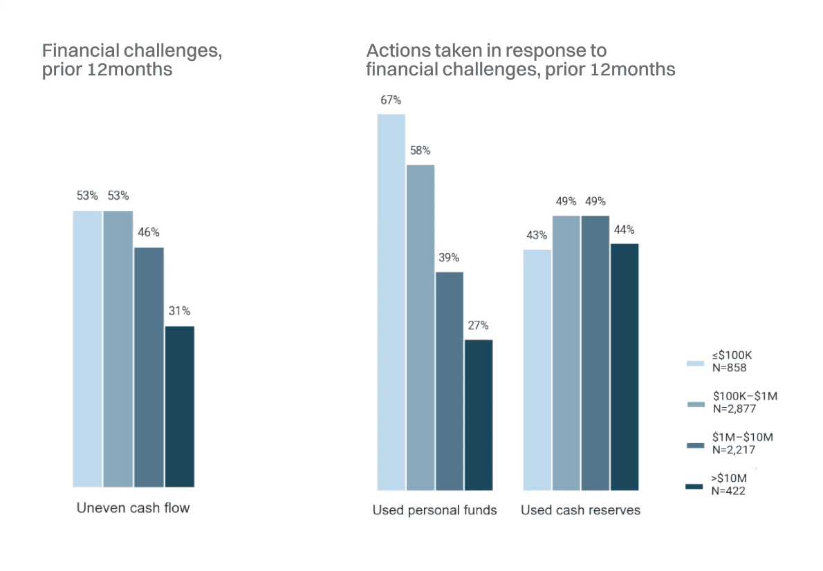
53% of ≤$100K-revenue businesses face uneven cash flow
67% of ≤$100K-revenue businesses used personal funds during a cash crunch
Quantitative research
- Reddit, r/small business

"I think the biggest frustration is not knowing exactly when money comes in and goes out."
“The mixing personal and business money thing is so real."
Insights
Their actual problems are…
(a) cash flow invisibility, (b) personal/business fund mixing, and (c) no way to plan ahead financially.
User Persona

Solution
Feature Prioritization

Created an easy and accessible financial dashboard for small business owners to effectively manage unpredictable cash flow and help further budgeting
It allow the user to:
View a summary of their financial status
Generate and view detailed financial reports
Set and track financial goals
Focus
I put the most weight on Flow 3: budgeting and actionable insight, because forward planning was the painpoint from user research, and at the same time, it’s a gap found in the competitor research.
Business
Competitive Audit
Y-axis: Complexity - Does the tool require accounting knowledge or not?
X-axis: Time orientation - Backward-looking (records) vs. forward-looking (forecasts, targets, planning)

Sources:
QuickBooks https://quickbooks.intuit.com/global/
Xero https://www.xero.com/
Wave https://www.waveapps.com/
Pigment https://www.pigment.com/
Zoho Books https://www.zoho.com/books/
Fathom https://www.fathomhq.com/
Takeaway
No competitor occupies simple & forward-looking. Tools that forecast require an existing accounting stack. Tools that are simple to start only report what already happened.
Process
User Flow
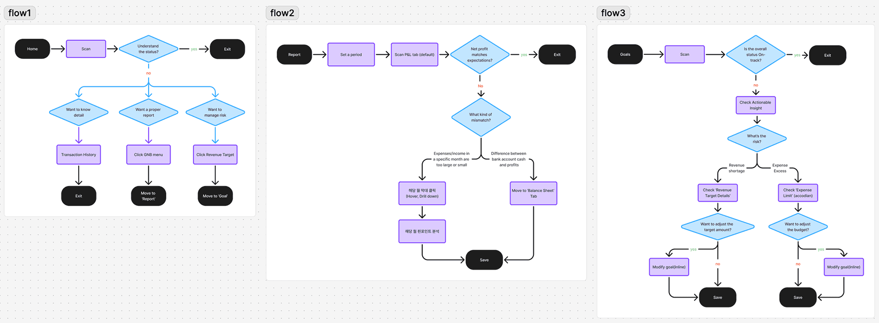
Low-Fidelity Sketching
Overview

Iterative Thinking
Flow 1 (Home)
Iterated on where to show personal fund inflow; considered registering separate personal accounts, landed on a small indicator under the Income card instead, toggleable in settings
Moved "revenue target % + how much more is needed" out of Home entirely; too heavy for a quick-glance screen, became Flow 3's core feature instead

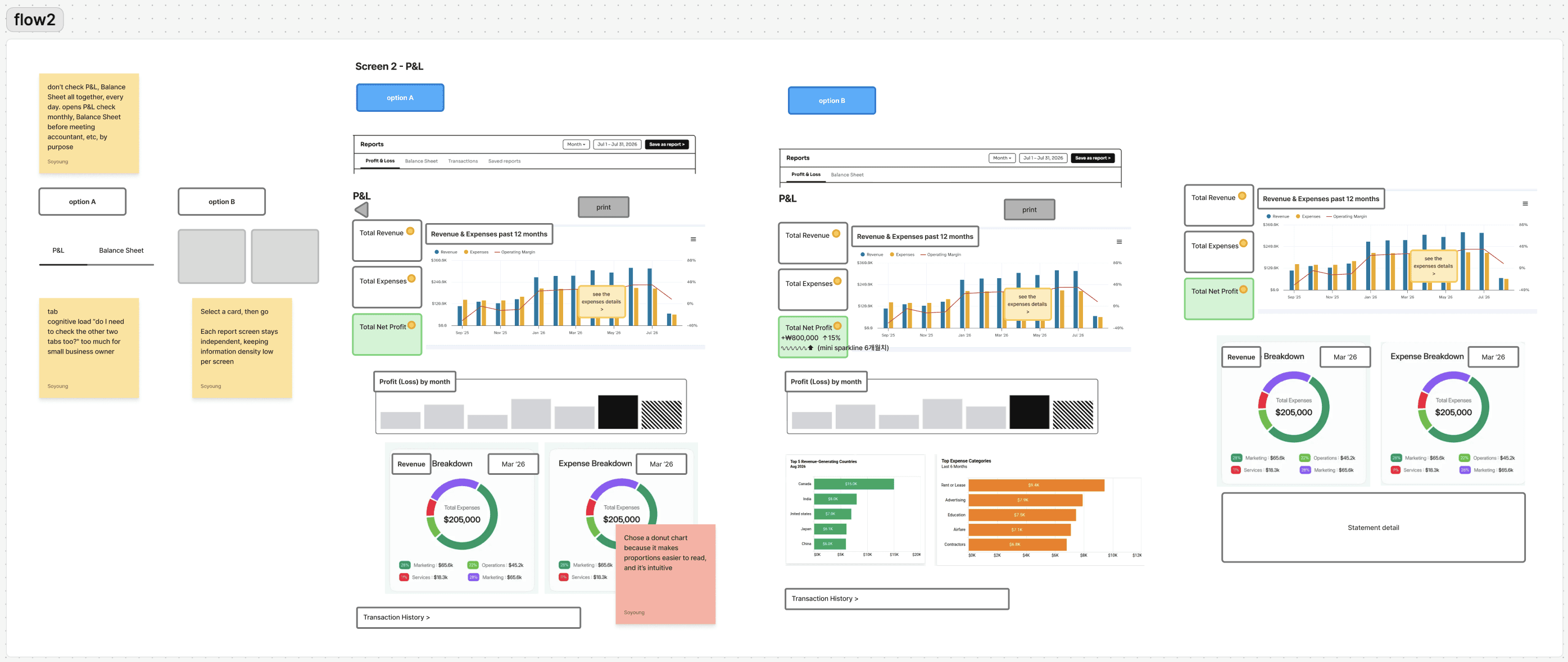
Flow 2 (Report)
Compared two navigation structures; three tabs side by side (Option A) vs. a card-based hub where each report opens independently (Option B) - final navigation pattern; breadcrumb, to minimize clicks
To show expense categories, compared two different types of chart; chose a donut chart because it makes proportions easier to read, and it’s intuitive
Move Transaction History to Flow 1
Flow 3 (Goals)
Moved the "Actionable Insight" section to the very bottom, after both Revenue and Expense sections; so the insight synthesizes both instead of appearing before the user has seen the full picture
Removed a cash flow graph that had leaked in from Flow 1

Outcomes
Visual Execution
Flow1 (Home)

Product Decision
Put personal money income to make users aware how much personal money are included.
Put current situation and forecast together for cash flow analysis to show forecast in simple interface.
Added the progress bar so users can understand the current status. This is connected with flow3.
Moved transaction history from flow 1 to flow 2 to let users check the it right away and compare with balance.
Flow2 (Report)

Product Decision
Breadcrumb navigation to reduce the number of clicks
Information (!) mark to explain financial terms
Drill-down designed for desktop web, replaced with a tap interaction on mobile
Show expense breakdown in donut chart to help users understand the loss right away
Flow3 (Goals)

Product Decision
Show simple and intuitive information in the top cards and put detailed information on the bottom
Move analysis on the most bottom, to integrate both revenue and expense to insights - the flow aims to check revenue → check expense → final insights
Deliver intuitive descriptive insights that solve the 'no way to plan ahead' pain point for non-financial users
More Projects

